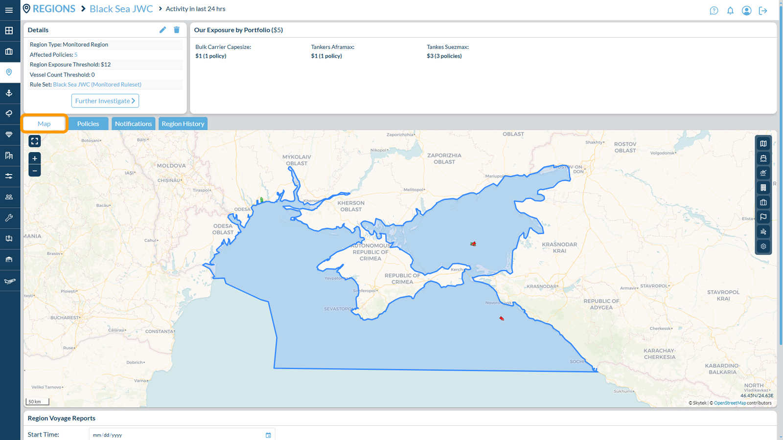
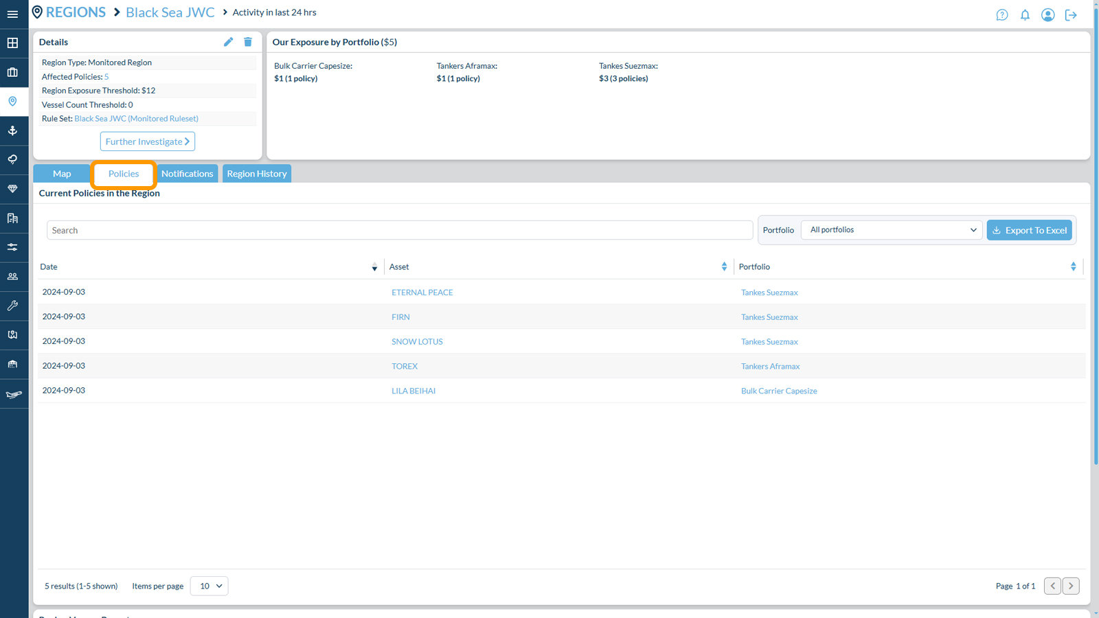
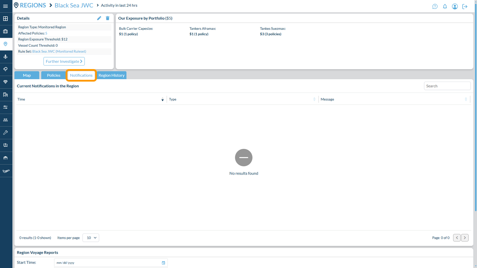
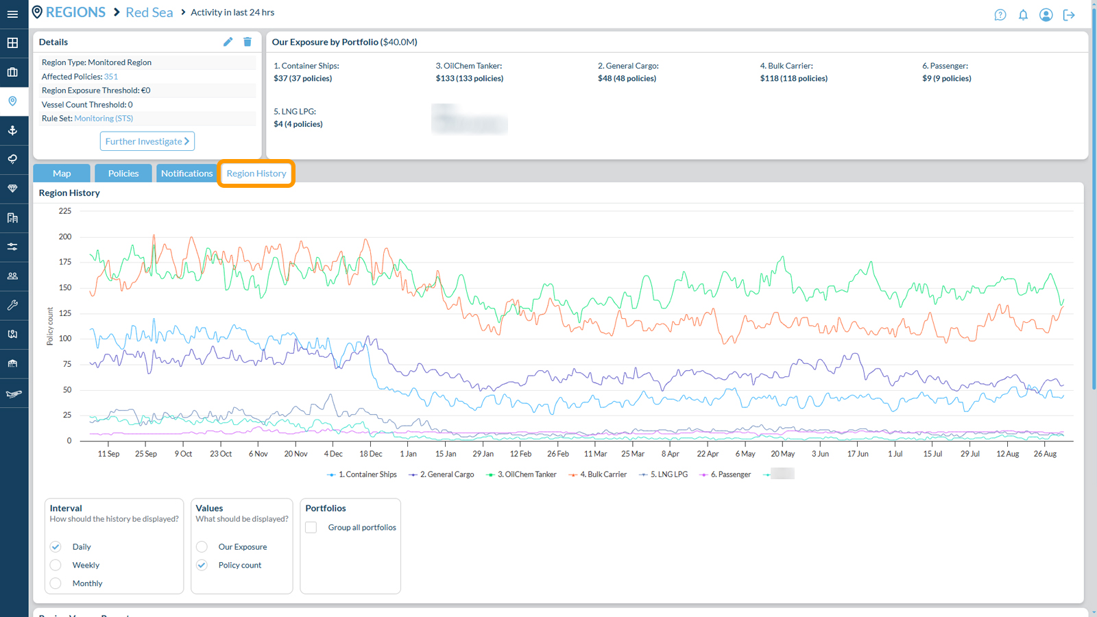
The region feature provides the user with several tabs to investigate the assets contained within.
Map – this tab will provide the visual distribution of the assets from the existing portfolios captured in the region within past 24 hours.
Policies – The system presents a tabular view that includes a comprehensive list of all assets captured within the region in the last 24 hours. Users have the capability to sort the list based on various criteria or apply filters based on portfolio preferences.
Notification – Following the defined rules for the region, the system will log alerts in this tab. Users have the ability to sort the tabular view by the type of alert or filter alerts of interest using the search tab located on the right-hand side.
Region History – The tab presents a graphical representation showcasing the aggregation of assets from all portfolios within the selected region over the past 12 months. Users can easily switch between different aggregation options such as Line Size, 100% Exposure, and the number of vessels in the region. The graph illustrates the average data across all portfolios, but users have the option to deselect the “Group All Portfolios” feature to view historical variations in the region for each individual represented portfolio.